Interactive tool · Pro bono · Oct 2026
A planting planner a landowner can use on their phone
A one-file, phone-first map of a 102-dönüm field: tap an area, pull a corner to resize it, pick a crop, see what it costs. Sent to a non-technical landowner as a WhatsApp attachment.
Problem & constraints
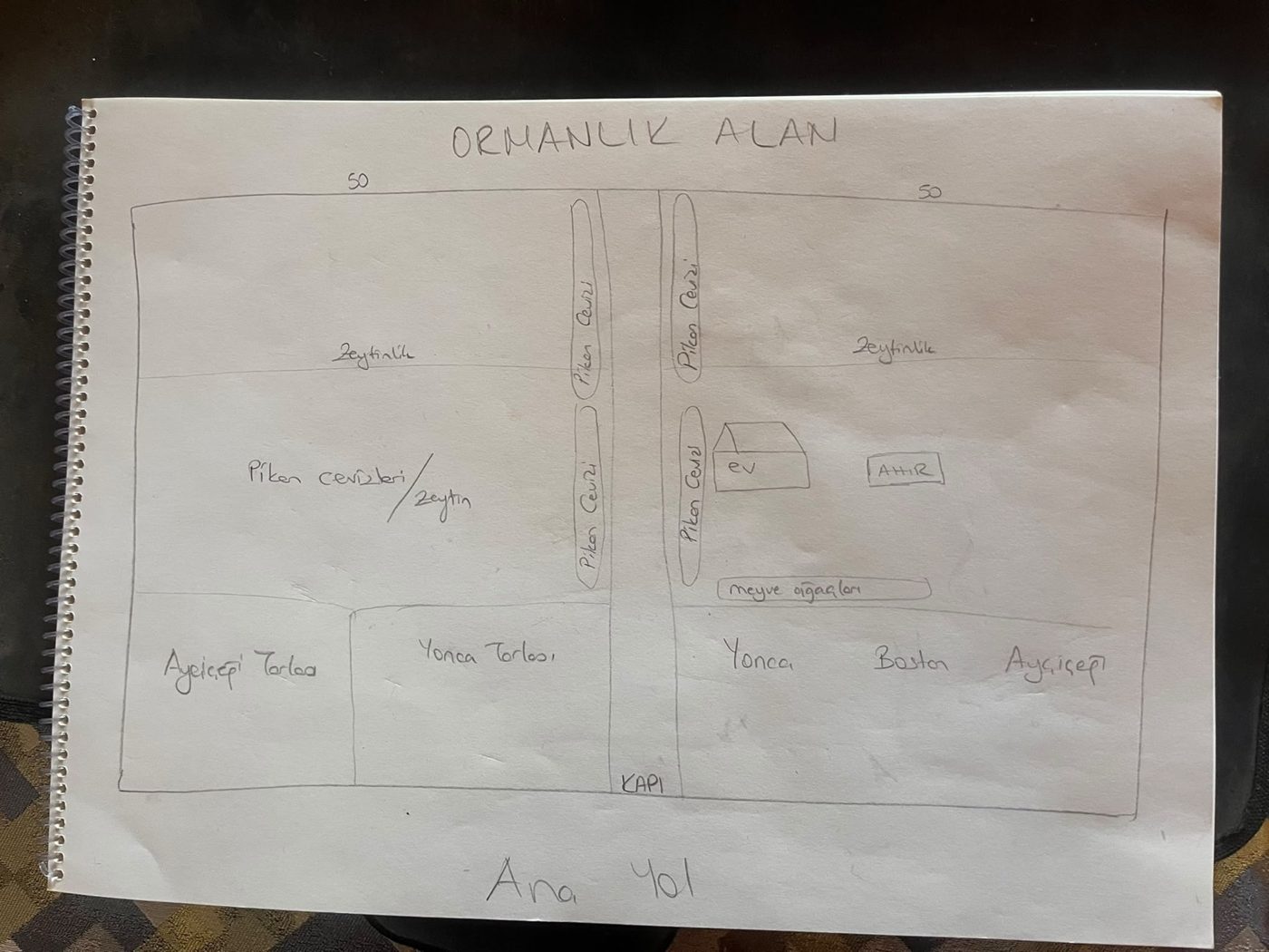
A family friend owns a 102-dönüm field (about 10 hectares) on the Gallipoli peninsula and wanted to know what could be planted on it, and roughly what each option would cost. The brief arrived as a hand sketch and two WhatsApp messages: an olive-spacing table and a yield timeline.
The person who would use the result is middle-aged, not comfortable with technology, and would open it on a phone. Their one explicit request was that it be "very, very simple". Everything else followed from that: no jargon, body text never below 17 px, 52 px buttons, no icon-only controls, and a page that works as a single HTML file attached to a chat message.
Process
I started from the real parcel instead of the sketch. The boundary came from the national cadastre service, converted to local metres and rotated so the existing dirt track runs straight up the page. A grid of 1-dönüm squares (the unit every Turkish farmer thinks in) is clipped to that boundary; edge slivers merge into their neighbour so no square is unusably small. Satellite imagery sits underneath, which is how the sketch's "road in the middle" turned out to be real, and how the neighbour's farm at the southern tip was found and excluded from the plan.
All geometry, areas and costs are computed in a small Python model and inlined into one HTML file at build time. The page itself has no framework and no build step beyond that, so it opens from a chat attachment on any phone.
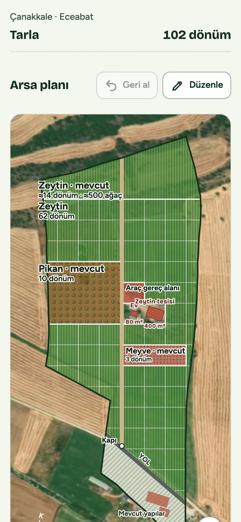
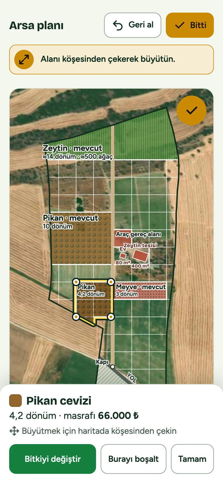
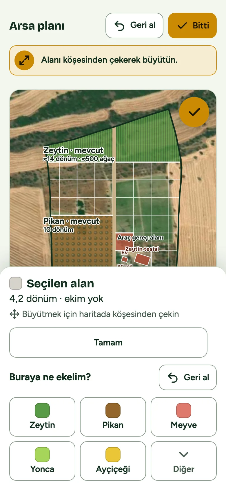
Every version was published to a shared link and tried on the owner's own iPhone through WhatsApp. Seventy-eight versions shipped in two days, each one answering a concrete complaint ("my hand selects an area by accident", "I can't tell the cards open", "the scroll stops on the map"). The decisions below are the ones that changed the interaction model.
Key decisions
1 — The map is a picture until you press Edit
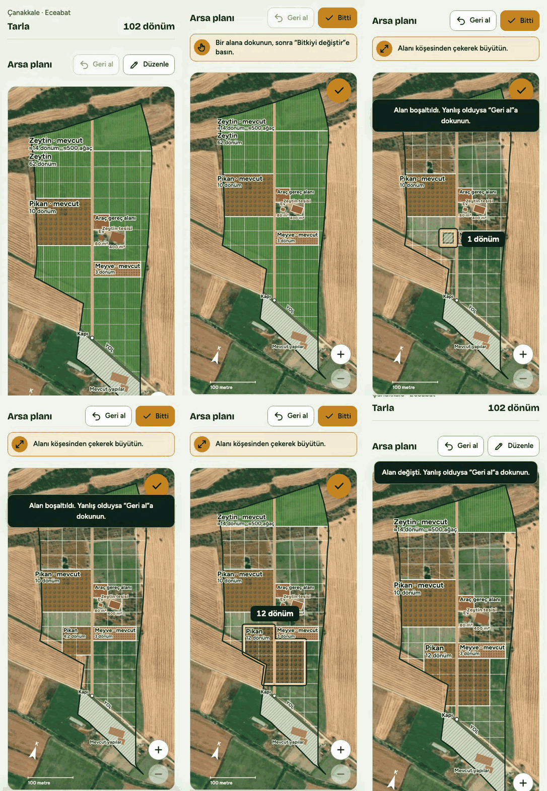
Early versions let you drag on the map at any time, which meant a finger that wanted to scroll the page got trapped on the parcel. Now the map is inert by default: the page scrolls, nothing selects. A single "Düzenle" (Edit) button turns the gestures on, scrolls the map to fill the screen, and becomes a gold "Bitti" (Done) that is always in reach.
Rejected: blocking page scroll over the parcel withtouch-action: none. It fixed selection and broke reading.
2 — Pull a corner, don't paint squares
The first editing model asked people to tap individual 1-dönüm squares. The owner found it fiddly and "not finished". The replacement: any drag that starts inside a field grows or shrinks that field in whole-dönüm steps from the nearest corner, and adjacent areas with the same crop always merge, even across the road. One gesture, no modes.
Rejected: a two-mode picker ("whole area" / "square by square"). Removed entirely in version 6.
3 — Two steps between a tap and a decision
"My hand picks an area by mistake and a panel full of information jumps up." A tap now only highlights the field and shows a thin strip (crop, area, cost). The crop buttons, undo and the cost breakdown live behind one primary action, "Bitkiyi değiştir" (change the crop). Accidental taps cost nothing.
Rejected: a smaller one-step panel, and long-press to select. Neither is discoverable for this user.
4 — Hints that advance with progress, not with a timer
There are three things to learn: tap an area, pull a corner, zoom with two fingers. Each hint sits in a gold note with its own gesture icon and is dismissed by doing the thing, not by waiting. The zoom hint only appears while the whole map fits on screen, because that is the only moment it is true.
Rejected: rotating tips on a timer, and a permanent "Tap here" bubble on the map. Both were read as noise.
5 — Colour by the real plant, checked for colour vision
Crops are coloured like the crop: dark olive green, pecan-shell brown, fresh alfalfa green, coral for fruit, sunflower yellow. Every adjacent pair was validated at ΔE ≥ 15 (≥ 12 under simulated colour-vision deficiency). The Done state is harvest gold rather than green, because a green button on a green map disappeared.
Rejected: the design tool's first palette suggestion (pink and gold) and a green Done button.
6 — What already grows there is locked, and free
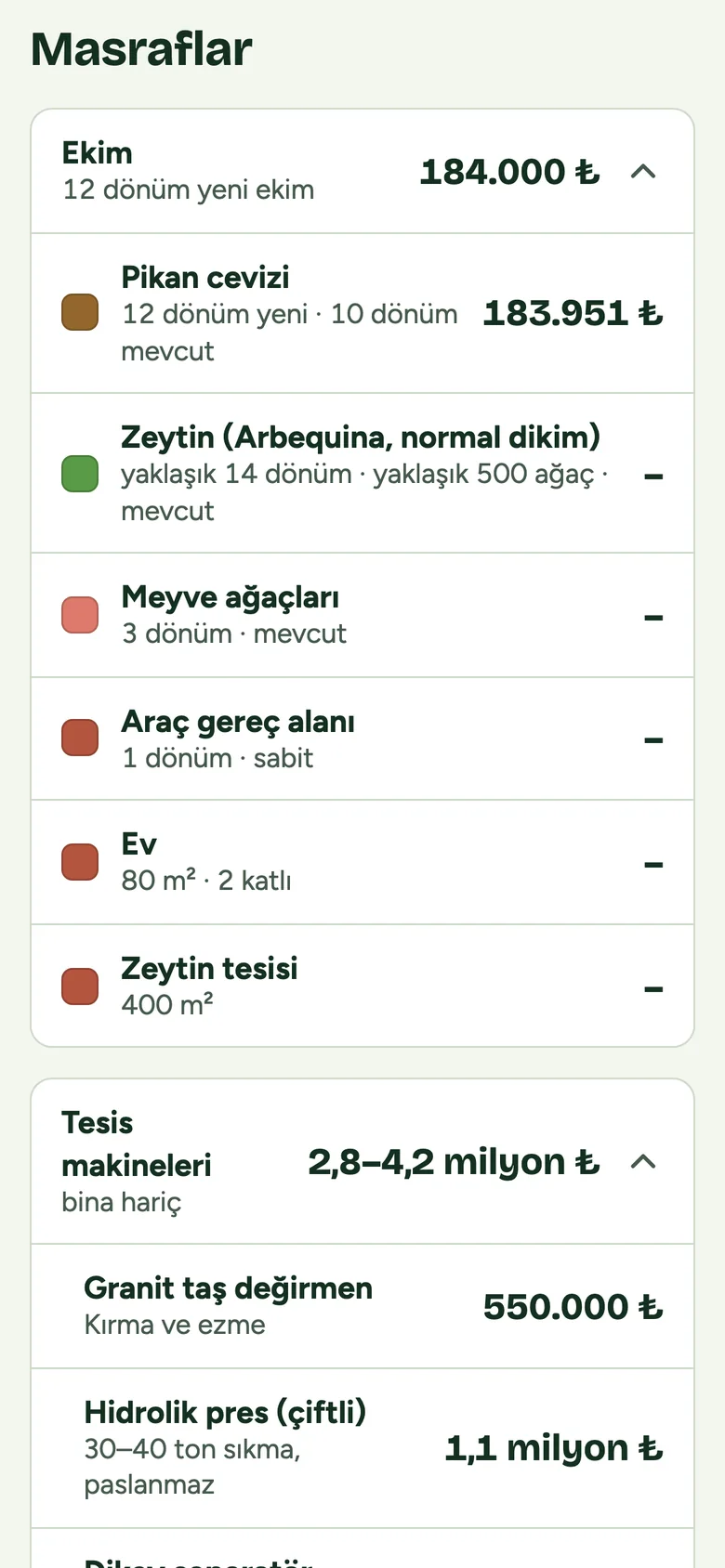
The link always opens on the owner's current layout: the existing olives, pecan and fruit trees are fixed and cannot be edited. Costs are only counted for new dönüm, so the number at the bottom answers the real question: what would the change cost, not what the whole farm is worth.
Rejected: a fully editable proposal plan. It kept resetting the conversation to "but that part is already planted".
The whole gesture, end to end
Edit, clear a proposed olive block, draw a new field on bare ground, choose pecan, pull a corner to grow it. The area and cost update live under the finger.
Try it
The demo below is the real file, in Turkish because that is the client's language. Press Düzenle, tap a field, pull a corner.Open it full-screen.
Outcome & what's next
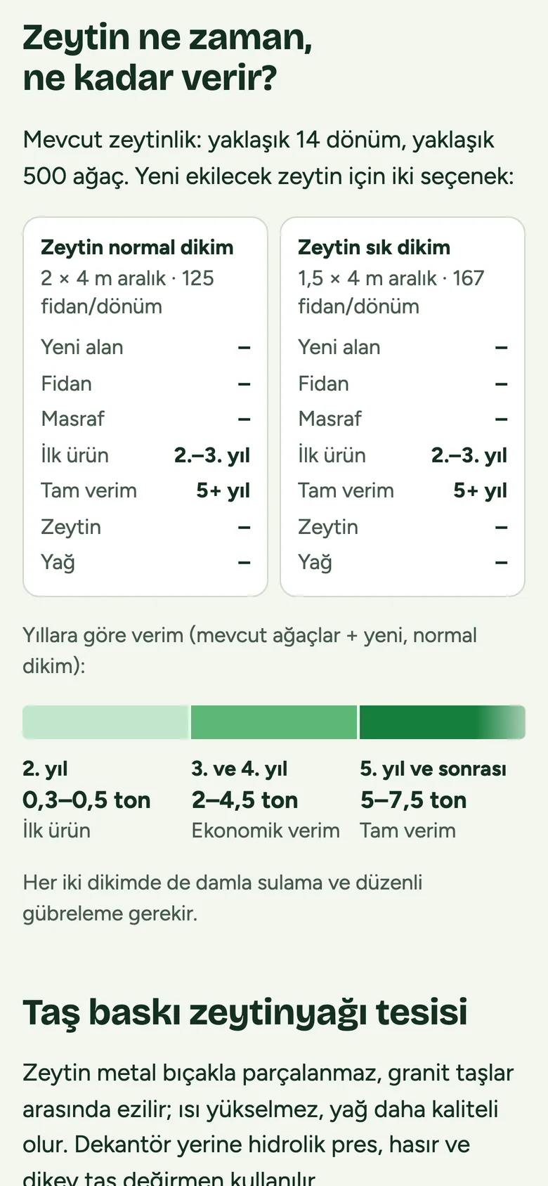
The owner uses the plan on their phone and has sent back their own layout, which is now the default. Beyond the map, the page carries the olive yield timeline, an olive-oil mill section with a machinery list, and a cost breakdown in two collapsible cards. The prices are rough 2026 estimates and say so.
What I would do next: an English build of the demo, a "save as image" button that was removed late (the owner preferred screenshots), and real quotes from the local nursery and irrigation supplier to replace the estimates. A few behaviours (smooth scroll on Edit, two-finger zoom) were verified on the owner's iPhone rather than in a simulator; the rest of the testing ran in a desktop browser at phone width.